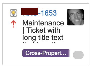
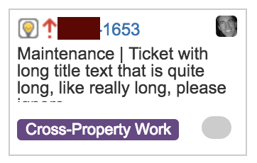
We use JIRA's kanban board for daily workflow of tasks. I started having an issue with the default JIRA board layout where the cards do not show enough of a task's title, especially when you pseudo-group tickets by prefixing their title with some context.
Given that, I decided to hack the CSS of JIRA's board to improve this. Take a look at an example before/after of the tweaks below, then I'll walk through how you can get it if you so desire.
Before

After CSS Hack

How did you do that?
- Install a CSS style plugin into your browser. This post all use Stylebot for the Chrome web browser.
- Just install the plugin from the Chrome store by clicking this link and selecting
[+ ADD TO CHROME]button on the upper right of the page.
-
Once the plugin is installed. Close all tabs and re-open a tab to the JIRA kanban board.
-
Click the new Stylebot plugin
CSSbutton and theOpen Stylebot...option in your chrome browser toolbar which will open up a U.I. that allow you to mess around with the page's style. -
At the bottom of the Stylebot click
Edit CSSwhich will give you a blank text box you can write custom CSS into. -
Paste in the following CSS and hit
Save
/** Version 2.3
 ** Copyright Jason Jarrett
 **/

.ghx-avatar-img {
    font-size: 15px;
    height: 15px;
    line-height: 15px;
    width: 15px;
}

.ghx-band-1 .ghx-issue .ghx-avatar {
    left: 100px;
    right: auto;
    top: -3px;
}

.ghx-band-3 .ghx-issue .ghx-avatar {
    top: 0px;
}

.ghx-issue .ghx-extra-fields {
    margin-top: 5px;
}

.ghx-issue .ghx-flags {
    left: 20px;
    top: 5px;
}

.ghx-issue .ghx-highlighted-fields {
    margin-top: 5px;
}

.ghx-issue .ghx-type {
    left: 5px;
    top: 5px;
}

.ghx-issue-content {
    font-size: 12px;
    margin-top: 3px;
    padding: 5px;
}

.ghx-issue-fields .ghx-key {
    margin-left: 30px;
}

.ghx-issue.ghx-has-avatar .ghx-issue-fields, .ghx-issue.ghx-has-corner .ghx-issue-fields {
    padding-right: 0px;
}

/* the below adjusts the backlog view */

.ghx-backlog-column .ghx-plan-extra-fields.ghx-row {
    float: right;
    position: relative;
    right: 70px;
    margin: 0;
    margin-top: -15px;
    height: 18px;
}

.ghx-backlog-column .ghx-issue-content, .ghx-backlog-column .ghx-end.ghx-row {
    padding: 0;
    margin: 0;
}

/* filters */
.js-quickfilter-button {
    padding: 0;
}
.js-sprintfilter {
    white-space: nowrap;
}
.js-sprintfilter > span {
    padding: 0;
}
dl dt, dd {
    margin: 0;
    padding: 0;
}

span.ghx-extra-field {
    margin-right: 100px;
}

span.ghx-end.ghx-extra-field-estimate {
    padding-top: 0;
    padding-bottom: 0;
}

div.ghx-plan-extra-fields.ghx-plan-extra-fields-1.ghx-row {
    height: 20px;
}

.ghx-issue-compact .ghx-row {
    margin: 0px;
}
div.ghx-plan-extra-fields.ghx-plan-extra-fields-1.ghx-row {
    margin-top: 0;
}
Now you should get a little bit more visible data on the page and be able to avoid hovering over titles to get enough context of the ticket to immediately know what it is.
Happy (as best you can) JIRA'ing